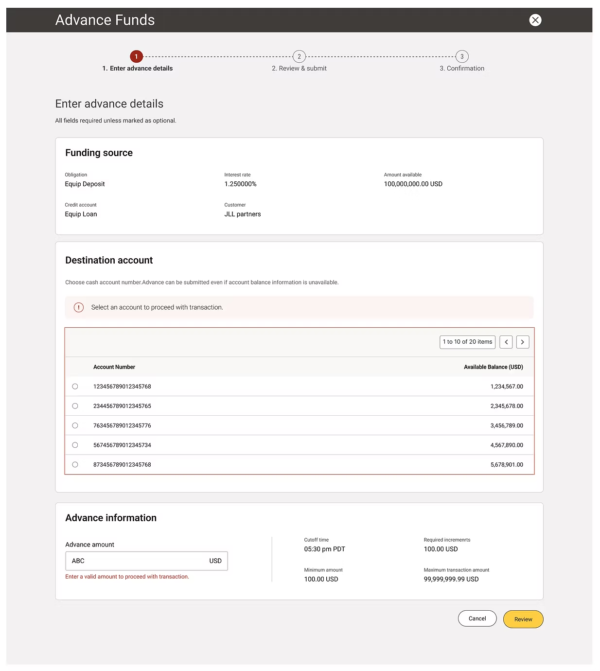
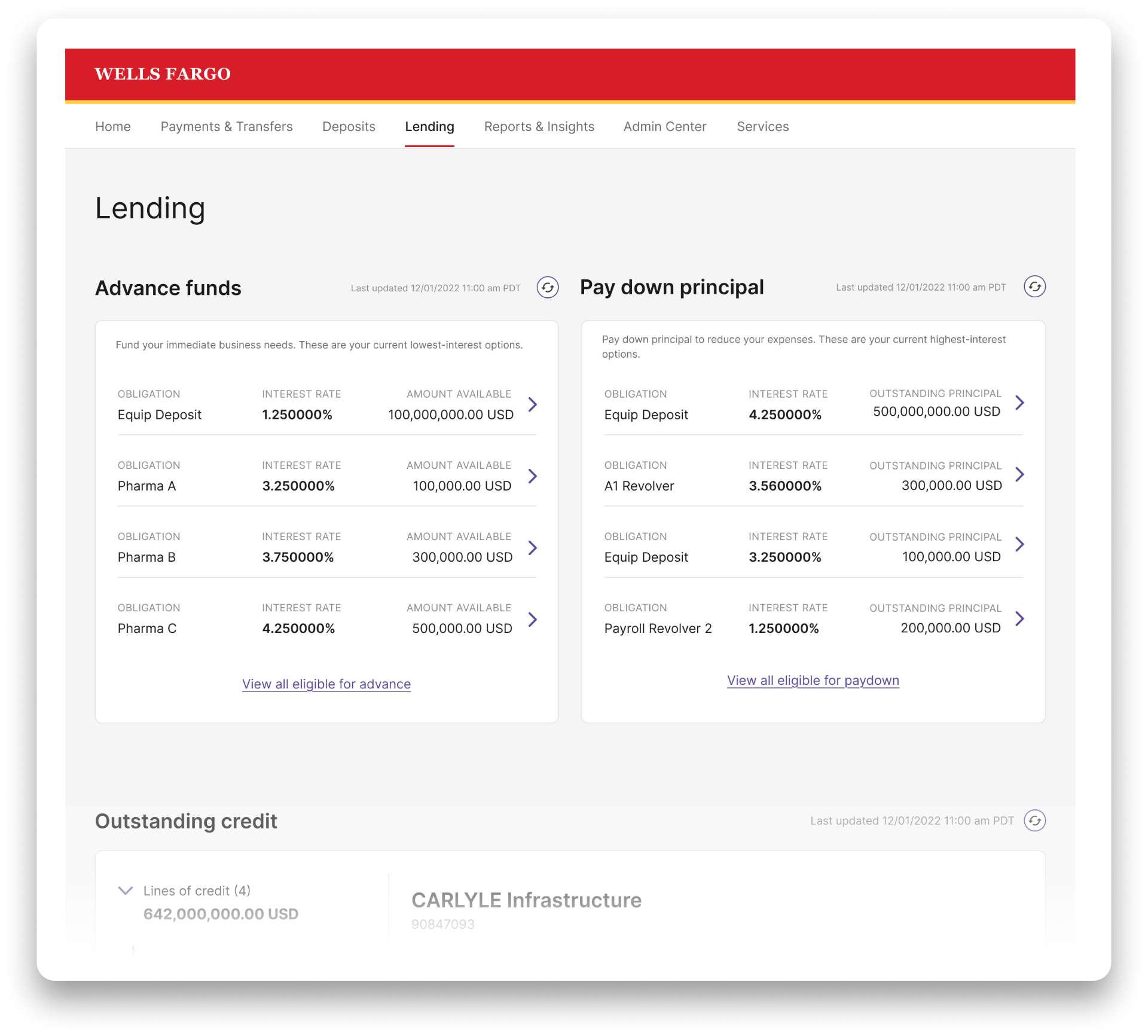
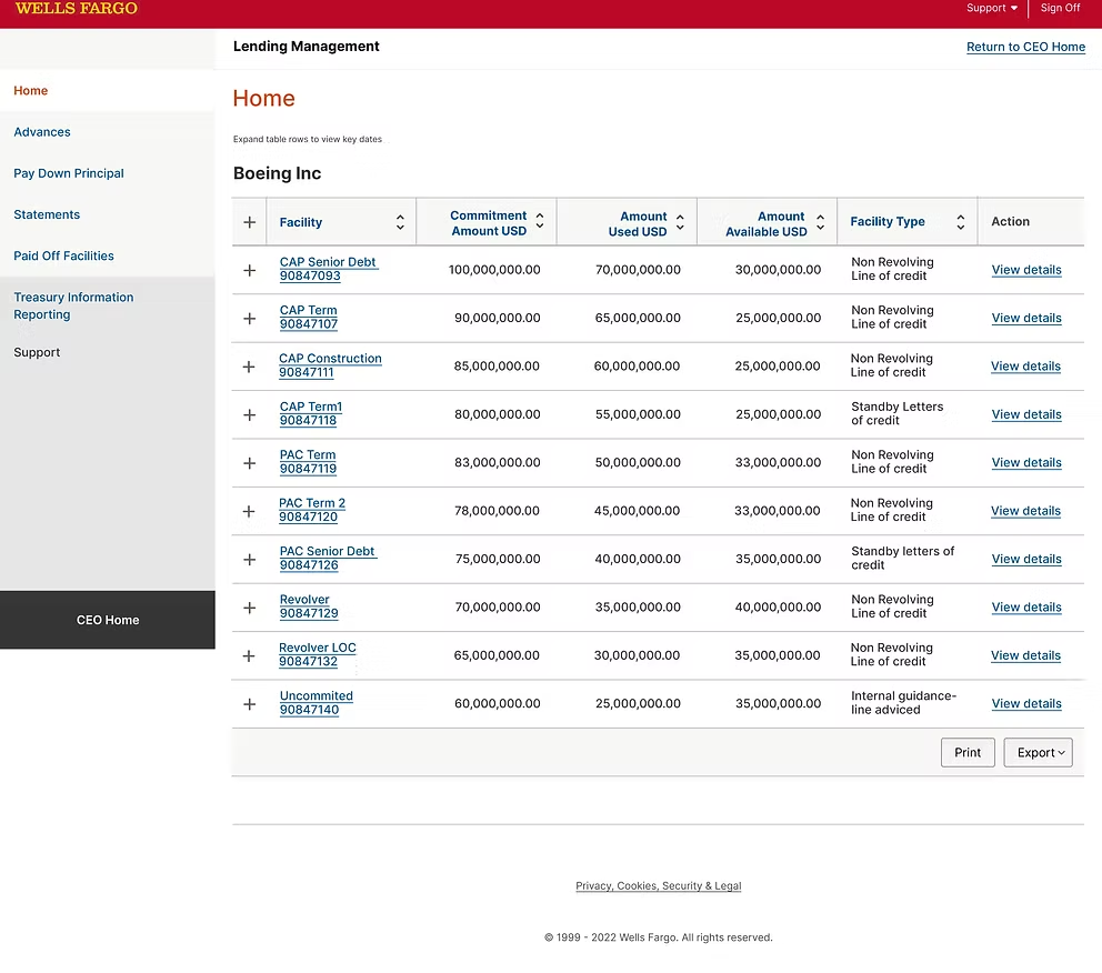
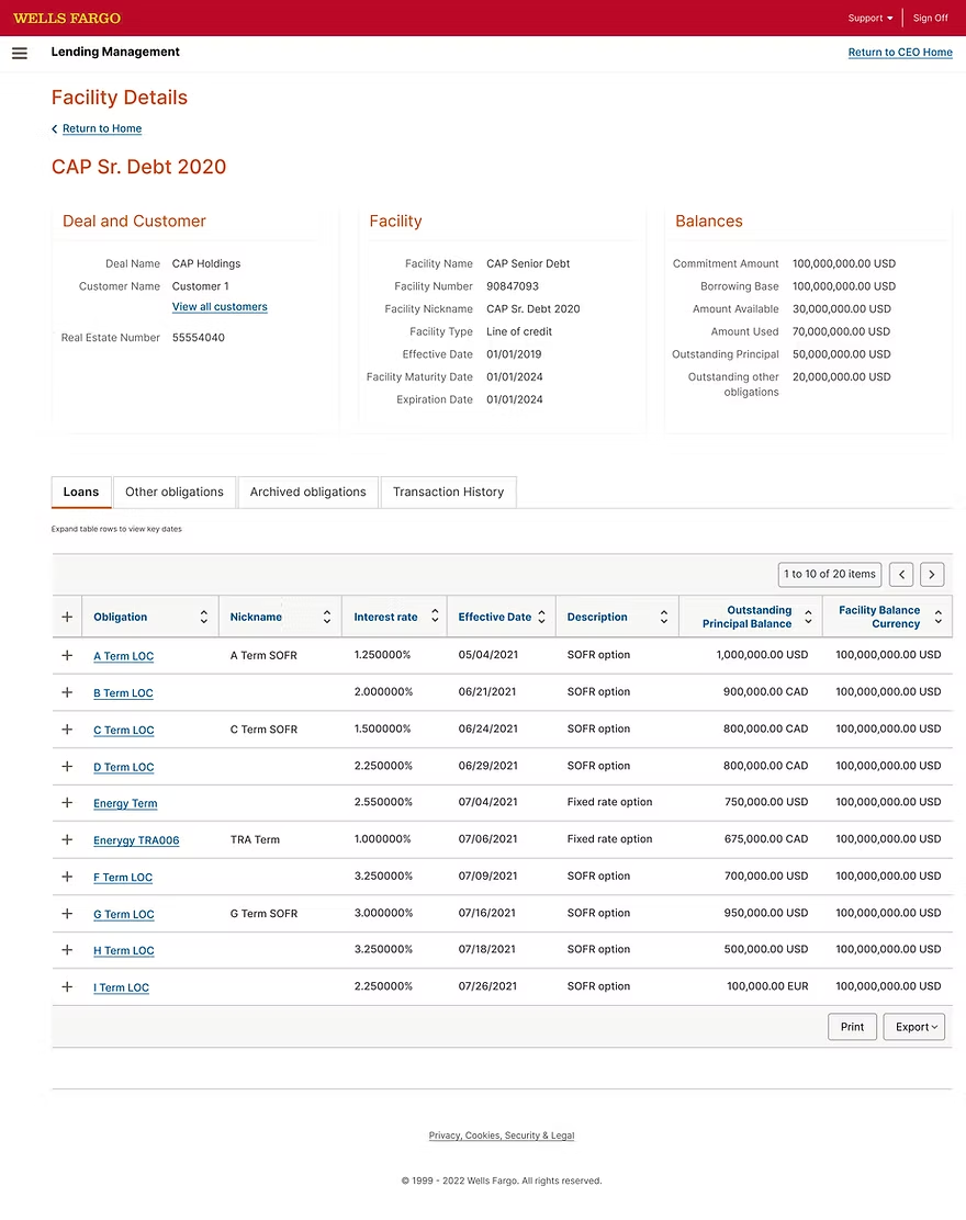
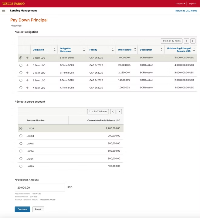
Back to all case studies

Case Study · Enterprise B2B · 2019–2020

Redesigning Wells Fargo's Lending Platform

How I redesigned the Lending experience inside Wells Fargo's CEO Portal serving 200,000+ business customers managing $450B in loans while contributing to the new CEO Portal Home and shared design system.

Lead Product Designer·10 months·Wells Fargo
Wells Fargo Commercial Banking lending dashboard

The Product

What is the Lending Platform?

Wells Fargo's Commercial Electronic Office (CEO) Portal is the bank's gateway for business banking used by 677,000 commercial customers to manage accounts, payments, lending, and treasury operations. The Lending Platform is one product inside CEO Portal: where 200,000+ businesses manage their loans, lines of credit, and letters of credit, totaling $450B in outstanding lending and roughly $11B in annual revenue.

By 2019, Lending had grown faster than it was designed. Customers were calling support to complete tasks the interface should have made obvious, and the bank was absorbing the cost in service hours and lost trust. Our squad was given 10 months to redesign it.

My Role

Lead Product Designer on the Lending Platform squad. I owned the Lending Platform redesign end-to-end, and contributed to two adjacent workstreams: the new CEO Portal Home redesign, and the Central Design team's shared design system.

What I owned

Lending Platform end-to-end research synthesis, information architecture, interaction design, visual design, validation, and rollout. Every Lending screen in this case study was led and shipped by me with my squad.

What I contributed to

I helped finalize the new components and widgets that powered the CEO Portal Home redesign payment widgets, account cards, alert patterns working alongside the CEO Portal squad's lead designers. I also contributed Lending-specific components to the Central Design team's shared library.

Team & timeline

1 Lead Designer (me), 1 supporting designer, 1 researcher, 2 PMs, ~8 engineers on the Lending squad. 10 months total: 8 weeks discovery, 16 weeks design, 16 weeks validation & rollout. Phased release across 2019–2020.

The Problem

A portal that grew faster than it was designed.

Over the years, the platform became complex and difficult to use. Customer interviews revealed three common pain points.

Disconnected experience

Lending sat inside CEO Portal but felt like a separate product. Different navigation, different interaction patterns, different visual language than the rest of the portal.

Cluttered dashboard

The Lending home page surfaced every account, every status, and every action at the same visual weight. No hierarchy, no journey, no sense of what to do next.

Hidden features

Advance Funds, Pay Down Principal, and rate-shopping tools were buried multiple clicks deep. Customers called the bank rather than hunt for them.

Process

How I approached it

A pragmatic three-phase loop small enough to ship, deep enough to learn.

Step 01
Discover & Define
Step 02
Design
Step 03
Validate & Evolve

CUSTOMER SEGMENTS · PROVIDED BY STRATEGY & RESEARCH

Three customer segments shaped every decision

Wells Fargo's strategy and user research teams had already developed customer segments before the Lending redesign began. These weren't three individual people - they represented three distinct clusters of business customers, each with different jobs to be done, different financial behaviors, and different reasons they came to the portal. My role was to apply these segments to design decisions throughout the project, making sure every flow and feature served at least one segment well, and ideally all three.

SEGMENT 01 · GROWTH-STAGE
A
GROWTH-STAGE

Ambitious Amy

VP Finance, Cybersecurity SaaS

Amy runs finance for a fast-scaling SaaS company. She has fifteen minutes between meetings to check cash positions, approve wires, and flag anything risky for her CFO.

What this segment needs from Lending

Speed and clarity. Quick advance decisions, clear cash position, minimal clicks. Doesn't need every feature - needs the right feature, immediately.

SEGMENT 02 · OPERATIONS-HEAVY
E
OPERATIONS-HEAVY

Efficiency Ella

Treasurer, Pharmaceutical R&D

Ella manages liquidity across multiple international subsidiaries. She lives in spreadsheets, builds her own dashboards, and needs every system to keep up with the pace of her decisions.

What this segment needs from Lending

Visibility across many accounts. Likes to see everything at once. Needs the portal to keep up with her decisions, not slow them down.

SEGMENT 03 · DETAIL-DRIVEN
M
DETAIL-DRIVEN

Meticulous Mike

Controller, CRE Property Management

Mike is responsible for every transaction matching every record. He distrusts software that hides things and double-checks anything important by phone.

What this segment needs from Lending

Confidence over speed. Wants every transaction confirmed, every status visible, every audit trail intact. Reads the fine print.

HOW I USED THESE SEGMENTS

Every major design decision was tested against all three segments. The single-page dashboard had to work for Amy's 15-minute scan, Ella's multi-account oversight, and Mike's careful audit. The 3-step modal had to feel fast enough for Amy, scalable enough for Ella's many transactions, and trustworthy enough for Mike to commit without second-guessing. When a decision served only one segment, I went back and rethought it.

Research approach

Five weeks of remote contextual interviews with active customers across industries and company sizes. Sessions were recorded, transcribed, and synthesized into an affinity map shared with PMs and engineering.

12
Interviews
720
Recording mins
20+
Insights synthesized

Key Findings

What Lending customers told us

01

The dashboard felt cluttered. Customers couldn't find what mattered most.

02

Loan balance information wasn't clear enough to manage loans confidently.

03

Key features like Advance Funds and Pay Down Principal were hidden inside the navigation.

04

Customers had to switch to a different product just to check their cash balances.

05

Customers wanted proactive alerts before renewals and deadlines - not after.

"
I have to log in to three different places just to see what's happening with my accounts. It's exhausting.
CFO, Mid-market manufacturing
INFORMATION ARCHITECTURE · USER FLOWS

Mapping the territory before designing the pixels

Before drawing a single screen, I mapped out every place customers went inside the portal and inside Lending. The flows below were the conversation tool I used with PMs and engineering, they helped us agree on the scope of the redesign, the features we needed, and what kind of UI each step should be.

How to read these diagrams

Every node in these flows is typed by the kind of UI it is, so a reader can tell at a glance whether something is a full page or a smaller surface inside one. A solid white block is a standalone page. A dashed outline is an overlay or modal that sits on top of another page. A gray block is a micro frontend, a self-contained module embedded inside a page. A highlighted block marks the areas I worked on: green for the surfaces I contributed to (CEO Dashboard) and the ones I owned (Lending, with its three core flows).

CEO Portal, the whole picture

CEO Portal user flow showing the customer journey from login through Token Validation to CEO Dashboard, branching into six top-level products (Payments & Transfers, Deposits, Lending, Reports & Insights, Admin Center, Services) and three dashboard widgets (Tasks, Accounts, Create Payments & Transfers). CEO Dashboard and Lending are highlighted in green as the focus areas.
Enter Company, User ID and Password
Token Validation
CEO Preferences
CEO Dashboard
Payments & Transfers
Deposits
Lending
Reports & Insights
Admin Center
Services
Payments Preferences
Lending Preferences
Tasks
Accounts
Create Payments & Transfers

← scroll to see the full flow →

The full CEO Portal user flow, from login through every top-level product. CEO Dashboard and Lending are highlighted in green, the dashboard where I contributed components and widgets, and the Lending platform I owned end-to-end. The gray blocks below CEO Dashboard (Tasks, Accounts, Create Payments & Transfers) are the micro frontends embedded inside the dashboard, several of which used the widgets I helped shape.

Lending, zoomed in

Lending user flow showing three main journeys branching from Lending: Advance Funds and Pay Down Principal each follow a three-step pattern of Enter details, Review, and Confirmation; and Outstanding Credit Balance leads to Credit Accounts with Loans and Non Loans as terminal sections.
Lending
Advance Funds
Enter Advance Details
Review Advance Details
Confirmation
Pay Down Principal
Enter Paydown Details
Review Paydown Details
Confirmation
Outstanding Credit Balance
Credit Accounts
Loans
Non Loans

← scroll to see the full flow →

The Lending user flow, expanded. Three core journeys branch off from Lending, Advance Funds, Pay Down Principal, and Outstanding Credit Balance. The first two share an identical three-step pattern: a dashed Enter details overlay, a Review overlay, then a Confirmation overlay. This consistency is intentional, customers learn one pattern and apply it everywhere money moves. Outstanding Credit Balance is the third path, leading into Credit Accounts with Loans and Non Loans as the terminal views.

Good architecture is invisible when it works.

These flows were the conversation that made everything else possible.

Before

What Lending customers were using before

Current Lending Home
Current Facility Details
Current Payments
Current Payments

Foundation

Building a flexible foundation

Before redesigning any Lending screen, the broader CEO Portal program needed a foundation a system every squad could build on. I joined the Central Design team's working group to help shape and adopt these foundations for Lending.

01
Color & Tone

A primary red anchored by warm neutrals, with semantic colors for success, warning, and error. Every value met WCAG 2.1 AA contrast minimums against both light and dark backgrounds.

02
Type System

A 7-step type scale tied to an 8-point baseline grid. Display, heading, body, and caption styles, all published as Figma text styles so any designer could apply them with one click.

03
Layout Grid

A 12-column grid with 8-point gutters, applied as a Figma layout grid style to every page. Every widget, card, and module snapped to the same rhythm.

04
Interaction Patterns

Documented patterns for selection, navigation, validation, and confirmation. Anything used twice across the portal became a pattern in the library, not a one-off.

05
Accessibility

44×44 touch targets, visible keyboard focus, ARIA roles on every interactive component, and screen-reader-tested across all flows. Accessibility shipped with each component, not after.

06
Tone of Voice & Content

Plain-English UI strings replacing internal bank jargon. A content checklist for empty states, errors, and confirmations, so every voice across the portal sounded like one bank.

OWNED WORK·LENDING PLATFORM REDESIGN

From cluttered dashboard to a four-step funding journey

Customers told us the old Lending experience felt clunky and unclear. They wanted to see all their credit accounts in one place, advance funds without hunting through menus, and always know where they were in a transaction. We rebuilt the flow around four screens a unified dashboard, then a guided three-step modal so a treasury analyst could move money in under a minute, with confidence at every step.

Redesigned Wells Fargo Lending dashboard with Advance funds, Pay down principal, and Outstanding credit sections. Numbered annotations highlight key design decisions.

Lending Dashboard

  1. One dashboard for everything LendingThe entire Lending experience lives on a single page. No more jumping between separate screens.
  2. A clear front door to LendingThe page header sets context immediately, so customers know exactly where they are.
  3. Save money by paying down the right loansThe 'Pay down principal' widget surfaces customers' highest-interest loans first, so paying off the right one reduces their costs the most.
  4. Save money by advancing on the right loansThe 'Advance funds' widget surfaces the lowest-interest options first, so customers borrow against the cheapest credit available.
  5. Every credit account, grouped and scannableLines of credit, term loans, and letters of credit each grouped by type, so customers find what they need without scanning a flat list.
  6. Plain English instead of bank jargonWe replaced internal banking terms with words customers actually use, so new users understand the page without training.
  7. Status pills that surface what needs attentionReset Due and Maturing pills flag time-sensitive loans inline, so customers spot urgent items at a glance.
  8. Every detail, one click awayDeep links carry full context, so customers can drill into any account or loan without losing their place in the flow.

The redesigned Lending dashboard, one page that replaces what used to take three. The numbered callouts highlight the decisions that mattered most to Lending customers.

The full funding flow

The full Lending Management workflow from dashboard to successful transaction confirmation.

01
Dashboard
Lending overview with advance, paydown, and outstanding credit.
02
Enter Advance Details
Choose funding source, destination, and advance amount.
03
Review & Submit
Confirm all details before sending the transaction.
04
Confirmation
Successful transaction with receipt and confirmation number.
01
Lending dashboard

A single home for every credit account. The dashboard surfaces what customers asked for most: lowest-rate advance options on the left, highest-rate paydown options on the right, and every outstanding credit account in a single, sortable master-detail view below.

02
Enter advance details

Funding source pre-filled, destination chosen in one click. Once a customer taps 'Advance' on any obligation, the funding source carries over automatically. They pick a cash account, enter an amount, and see all the rules (cutoff time, min/max, increments) right next to the input.

03
Review & submit

One last look before money moves. A clean read-only summary of everything the customer entered, plus the estimated effective date. Edit, Cancel, and Submit sit side-by-side so the customer is never trapped in a decision.

04
Confirmation

Confidence, not just success. The confirmation screen gives customers everything they need for their records confirmation number, submission time, effective date, and a print option. The success is calm and professional, not celebratory.

Design Exploration · Alternatives

Approaches I considered before landing on the final design

The 3-step modal wasn't the obvious choice. Before settling on it, I explored two other patterns that were widely used in enterprise banking at the time. Each had real merits, and real reasons I rejected them in favor of the approach that shipped.

ALTERNATE 01

Full-page wizard

How it works

Each step lives on its own dedicated page. Customer navigates from Lending → Advance Funds Step 1 → Step 2 → Step 3 → back to Lending.

Why I recommended it

Familiar pattern for enterprise users. Lots of room for content on each step. Common in older banking applications, so customers might recognize it.

Reasons for not choosing this

Customers lost context every time they navigated. If they needed to cancel mid-flow, they couldn't easily return to where they came from. The hand-off between pages also slowed the flow significantly for a transaction that should feel quick and confident.

ALTERNATE 02

Side-panel drawer

How it works

A drawer slides in from the right edge, taking up roughly 60% of the screen. The Lending dashboard stays visible on the left.

Why I recommended it

Modern pattern, used by Stripe Dashboard, Plaid, and other fintech tools. Preserves dashboard context. Feels lightweight.

Reasons for not choosing this

Drawer width was too narrow for the data we needed to show: funding source, destination account selector with 20+ accounts, and transaction rules side-by-side. The drawer also felt like a 'lesser' surface for moving real money. Customers told us they wanted the transaction to feel important, not casual.

Shipped
FINAL DESIGN

3-step modal

How it works

A centered modal opens over the dashboard. Three clear steps: Enter → Review → Confirm. The dashboard stays visible behind for context.

Why I recommended it

Modal preserves dashboard context. Three steps break the form into a clear journey. The progress indicator gives customers a sense of where they are.

Why I chose it

It struck the right balance. Important enough to feel like a serious transaction, light enough to cancel without losing place. The 3-step structure also matched how customers naturally thought about the task: pick the source, confirm the details, get the receipt.

"The best design decisions aren't between good and bad. They're between three approaches that could all work, and finding the one that fits the moment best."

Design Decisions

The thinking behind the choices

Decision

Why a 3-step modal, not a full page?

The old flow took customers across multiple pages and broke their context. A modal keeps the dashboard visible behind, so customers always know where they came from and can cancel without losing their place.

Decision

Why show the funding source as read-only?

Customers entered this flow by clicking a specific obligation. Re-showing it as an editable field would suggest they could change it (they can't) and invite mistakes. Read-only confirms their choice without inviting confusion.

Decision

Why surface min, max, and cutoff next to the amount input?

The old experience put these rules in a separate help section. Customers had to leave the form to find them, then guess. Putting them next to the input eliminated the most common support call: 'Why was my advance rejected?'

Decision

Why a calm confirmation, not a celebration?

Treasury analysts are doing serious work, often on behalf of someone else's money. A clear check mark and the confirmation number is what they actually wanted confidence, not confetti.

System Feedback

Telling customers what's happening, clearly

Two patterns covered every state we'd seen in the wild quiet status messages inside widgets, and full-attention overlays for moments that mattered. I led the design of this messaging framework as part of my contribution to the CEO Portal Home, and it became the standard across Lending and the broader portal.

Inline widget messages eligible obligationsInline widget messages outstanding credit system outageInline widget messages no active credit accounts

Inline widget messages

Empty, loading, success, and warning states inside each card.

Overlay message Pay Down Principal no cash accountOverlay message Advance Funds validation

Overlay messages

Reserved for confirmation, risk, and irreversible actions.

What changed for the customer

01One-page dashboard built from reusable widgets
02Cash and credit accounts visible in the same view
03Advance funds and pay down principal both on the home screen, sorted by rate
04Deep links that carry context customers always know where they came from
05Plain-English labels replacing internal banking jargon
06Step-by-step modal flow so customers never lose their place
07Inline transaction rules to prevent rejected advances
08Read-only review step to catch mistakes before submission
09Confirmation screen with everything needed for records
USABILITY TESTING · PRE-LAUNCH VALIDATION

Validated before launch

Before rolling out the new Lending Platform, I partnered with the US-based user research team to validate the redesign with the people who’d actually use it. Sessions ran across three rounds — moderated walkthroughs, task-based testing, and a final unmoderated benchmark. I joined remotely as a silent observer, then synthesized findings with the researcher after each round.

WHO WE TESTED WITH
Treasury operators
Financial managers
Loan servicing teams
Internal banking users
WHAT CUSTOMERS SAID

Faster, clearer, simpler

  • Reduced clicks across every flow
  • Faster transaction completion
  • Clearer information hierarchy
  • Simplified multi-step workflow
  • Improved transaction summary visibility
WHAT THE DATA SHOWED

Validated against real tasks

28%
Reduction in transaction completion time
  • High task success rate across all 5 tested tasks
  • Fewer “where am I in this flow” moments in the review step
  • Participants stopped hesitating before clicking Submit
  • Reduced validation-related errors
WHAT WE’D ADD NEXT

Roadmap from testing

  • Toast alerts for success and failure
  • Insufficient balance warnings
  • Duplicate transaction prevention
  • Loan limit validation
  • Session timeout alerts
  • Confirmation step for high-value transfers

Testing didn’t just confirm the design — it shaped the roadmap. The improvements above became the priority list for the next release.

Impact

What changed after launch

80%

Drop in manual service requests

Lending Platform

50%

Drop in service & training calls

Lending Platform

99.9%

Lending uptime

post-launch

200K+

Active Lending customers

managing $450B in loans

My contributions to the CEO Portal Home and the shared design system also helped ship the broader portal redesign which now serves 677,000 commercial customers across 4.9M monthly sessions.

100% compliance with ADA, regulatory, enterprise, and CEO standards. All risk issues resolved prior to general availability.

CONTRIBUTING WORK·CEO PORTAL HOME

Contributing components and widgets to the new CEO Portal Home

While leading the Lending Platform redesign, I also contributed to the new CEO Portal Home the parent dashboard that all CEO Portal products would sit inside. The CEO Portal squad led the page design; I worked alongside them on the new components and widgets that powered it. My focus was on the patterns that Lending customers would also use elsewhere payment widgets, account summary cards, alert and notification patterns, and the system-wide messaging framework.

What the new dashboard delivered

Toggle between the pre-redesign portal and the redesigned dashboard to see what changed.

Redesigned Wells Fargo CEO Dashboard showing personalized greeting, Tasks summary cards, combined cash and credit Accounts widget with master-detail view, Create payments and transfers section, and a clean top navigation. Six numbered annotations highlight key contributions to the design.

CEO Dashboard

  1. One dashboard, not sixSix disconnected portal apps merged into a single home page.
  2. Top navigation with everything in reachOne consistent navigation across every product, so customers stop relearning the layout.
  3. Cash and credit in one widgetAccount types that used to live in separate apps now sit side by side.
  4. Today's tasks, right at the topApprovals, pending payments, and alerts surface the moment customers log in.
  5. A dashboard customers can shapeShow, hide, and reorder widgets through preferences. The home page fits how each customer works.
  6. Move money without leaving homeACH, wire, real-time, FX, and transfers. All available from the dashboard.

The redesigned CEO Dashboard owned by the CEO Portal squad. The numbered callouts highlight the new components, widgets, and patterns I contributed to as part of the central design effort.

Payment widgets

Reusable payment, transfer, and Advance Funds widgets. Designed for Lending first, then generalized for use across CEO Portal.

Account summary cards

Cash and credit accounts shown together in a single, scannable card pattern. Surfaced on the Home page and reused inside Lending.

Alerts and notifications

The notification and inline-alert patterns used across the new Home. I led the patterns for time-sensitive Lending alerts (maturity, rate resets, payment due).

System messaging framework

Empty, loading, success, warning, and error states both inline and overlay. Standardized across CEO Portal so every product spoke the same language.

CONTRIBUTING WORK·DESIGN SYSTEM 2.0

Partnering with the Central Design team to build a new system

The old portal was built on a framework called WFRIA. It worked, but it couldn't keep up with new product needs, accessibility standards, or the modern Wells Fargo brand. So we joined forces with the Central Design team to build Design System 2.0 a new Figma library of shared styles, master components, and patterns that every product team across the bank could use.

Why a new system was needed

01
Limited component coverage

WFRIA only included basic patterns. Every product team rebuilt the same widgets payment forms, navigation, account cards leading to inconsistent experiences.

02
Inconsistent visual language

Spacing, colors, and typography varied from product to product. The same button could look five different ways depending on which team built it.

03
No shared library

Every team kept their own Sketch files. When the brand updated a color or font, dozens of files had to be opened and updated by hand.

What I contributed

I was a contributing designer to the Central Design team while leading the Lending Platform redesign. My role on the system had three parts:

I helped define new component patterns based on what Lending and the broader portal needed payment widgets, account cards, alert and messaging frameworks.

I built and documented Lending-specific components in Figma that the Central Design team reviewed and published to the shared library.

I tested every new component in real Lending product screens, then fed learnings back to the central team before publishing bank-wide.

Why Figma

Wells Fargo's design teams were spread across Sketch files synced through Abstract. Hand-off was slow, libraries were duplicated, and stakeholders couldn't review work without a designer to drive a screen-share. Moving to Figma in 2019 unlocked three things.

Real-time collaboration

Multiple designers in one file at the same time. Stakeholders reviewed in their browser no plugins required.

One shared source of truth

A single published library every team pulled from, instead of dozens of synced Sketch copies.

Faster handoff

Engineers opened the file, inspected specs, and grabbed CSS without waiting on a Zeplin export.

Establishing the visual foundation with Figma Styles

We codified the visual foundation as Figma Styles color styles, text styles, and effect styles all published from a central library file. A designer on any team could apply a style with one click, and any future update to that style would push to every screen using it.

Color Styles · Brand
100
#FFE1E3
200
#FFC4C8
300
#FF969D
400
#F65860
500
#D71E28
600
#B7141D
700
#950F17
900
#5C0A10
Color Styles · Neutral
100
#F4F4F5
200
#E4E4E7
300
#D4D4D8
400
#A1A1AA
500
#71717A
600
#52525B
700
#3F3F46
900
#0A0A0B
Color Styles · Semantic
Success
#16A34A
Warning
#D97706
Error
#DC2626
Info
#2563EB

Every color was published as a Figma color style. A single update propagated to every product team that pulled from the library.

Typography styles

Text styles were named with a forward-slash convention so Figma grouped them automatically in the styles panel. Designers picked one from the dropdown never typed a font size by hand.

Style name
Size
Weight
Sample
Display/01
48px
700
Manage your money
Heading/01
32px
600
Lending Management
Heading/02
24px
600
Cash Accounts
Subhead/01
18px
500
Recent Activity
Body/Large
16px
400
View your balances...
Body/Default
14px
400
Last updated 2 hours ago
Caption/01
12px
500
AVAILABLE BALANCE

Spacing and grid

We standardized on an 8-point spacing scale and a 12-column grid, documented as a layout grid style applied to every page.

Spacing scale
4px· inline icon spacing
8px· tight stack spacing
12px· field padding
16px· card inner padding
24px· card outer padding
32px· block spacing
48px· section spacing
64px· hero section spacing
12-column layout grid
12 columns · 8px gutters · 16px outer margin

Building one library, used by every team

The heart of the system was the shared Figma library: a single file containing every master component, published to every product team at Wells Fargo. When a designer needed a button, an input field, or a payment widget, they pulled it from the assets panel never built one from scratch.

DesignSystem-2.0 · Figma
Pages
  • Cover
  • Foundations
  • Buttons
  • Forms
  • Cards
  • Navigation
  • Patterns
  • Documentation
Button/Primary
Button/Secondary
Button/Tertiary
Button/Destructive
Input/Text
Input/Search
Input/Select
Input/Date
Card/Account
Card/Alert
Card/Activity
Card/Loan
Inspect
Button/Primary/Default
W 120
H 40
Radius 4
Fill #D71E28
Text Body/Default

The library was organized by category across multiple pages, with master components named using a slash convention (Button/Primary/Default, Button/Primary/Hover) for clean discovery in the assets panel.

Designing for every state, the 2019 way

Figma didn't have Variants yet that wouldn't ship until late 2020. So we built every state of every component as its own master component, organized by naming convention. A button in our library wasn't one component with properties it was a family: Button/Primary/Default, Button/Primary/Hover, Button/Primary/Disabled, and so on, for every size and style.

Primary
Button/Primary/…
Default
Hover
Active
Focus
Disabled
Small
Button
Button/Primary/Small/Default
Button
Button/Primary/Small/Hover
Button
Button/Primary/Small/Active
Button
Button/Primary/Small/Focus
Button
Button/Primary/Small/Disabled
Medium
Button
Button/Primary/Medium/Default
Button
Button/Primary/Medium/Hover
Button
Button/Primary/Medium/Active
Button
Button/Primary/Medium/Focus
Button
Button/Primary/Medium/Disabled
Large
Button
Button/Primary/Large/Default
Button
Button/Primary/Large/Hover
Button
Button/Primary/Large/Active
Button
Button/Primary/Large/Focus
Button
Button/Primary/Large/Disabled
XL
Button
Button/Primary/XL/Default
Button
Button/Primary/XL/Hover
Button
Button/Primary/XL/Active
Button
Button/Primary/XL/Focus
Button
Button/Primary/XL/Disabled
Secondary
Button/Secondary/…
Default
Hover
Active
Focus
Disabled
Small
Button
Button/Secondary/Small/Default
Button
Button/Secondary/Small/Hover
Button
Button/Secondary/Small/Active
Button
Button/Secondary/Small/Focus
Button
Button/Secondary/Small/Disabled
Medium
Button
Button/Secondary/Medium/Default
Button
Button/Secondary/Medium/Hover
Button
Button/Secondary/Medium/Active
Button
Button/Secondary/Medium/Focus
Button
Button/Secondary/Medium/Disabled
Large
Button
Button/Secondary/Large/Default
Button
Button/Secondary/Large/Hover
Button
Button/Secondary/Large/Active
Button
Button/Secondary/Large/Focus
Button
Button/Secondary/Large/Disabled
XL
Button
Button/Secondary/XL/Default
Button
Button/Secondary/XL/Hover
Button
Button/Secondary/XL/Active
Button
Button/Secondary/XL/Focus
Button
Button/Secondary/XL/Disabled
Tertiary
Button/Tertiary/…
Default
Hover
Active
Focus
Disabled
Small
Button
Button/Tertiary/Small/Default
Button
Button/Tertiary/Small/Hover
Button
Button/Tertiary/Small/Active
Button
Button/Tertiary/Small/Focus
Button
Button/Tertiary/Small/Disabled
Medium
Button
Button/Tertiary/Medium/Default
Button
Button/Tertiary/Medium/Hover
Button
Button/Tertiary/Medium/Active
Button
Button/Tertiary/Medium/Focus
Button
Button/Tertiary/Medium/Disabled
Large
Button
Button/Tertiary/Large/Default
Button
Button/Tertiary/Large/Hover
Button
Button/Tertiary/Large/Active
Button
Button/Tertiary/Large/Focus
Button
Button/Tertiary/Large/Disabled
XL
Button
Button/Tertiary/XL/Default
Button
Button/Tertiary/XL/Hover
Button
Button/Tertiary/XL/Active
Button
Button/Tertiary/XL/Focus
Button
Button/Tertiary/XL/Disabled
Destructive
Button/Destructive/…
Default
Hover
Active
Focus
Disabled
Small
Button
Button/Destructive/Small/Default
Button
Button/Destructive/Small/Hover
Button
Button/Destructive/Small/Active
Button
Button/Destructive/Small/Focus
Button
Button/Destructive/Small/Disabled
Medium
Button
Button/Destructive/Medium/Default
Button
Button/Destructive/Medium/Hover
Button
Button/Destructive/Medium/Active
Button
Button/Destructive/Medium/Focus
Button
Button/Destructive/Medium/Disabled
Large
Button
Button/Destructive/Large/Default
Button
Button/Destructive/Large/Hover
Button
Button/Destructive/Large/Active
Button
Button/Destructive/Large/Focus
Button
Button/Destructive/Large/Disabled
XL
Button
Button/Destructive/XL/Default
Button
Button/Destructive/XL/Hover
Button
Button/Destructive/XL/Active
Button
Button/Destructive/XL/Focus
Button
Button/Destructive/XL/Disabled

"Without Variants, we relied on naming conventions and Instance Swap. It was manual, but it worked and it taught the team to think in systems."

Building payment patterns as reusable components

Payments are the most-used feature in commercial banking moving money between accounts, paying down loans, scheduling transfers. We turned every payment pattern into a master component so any product team could drop in a tested, accessible payment experience.

Payment/AmountInput
Amount
$12,450.00USD ▾
Available · $128,402.51
Payment/AccountSelector
From
Operating · 4421
Available $128,402.51
Payroll · 9912 · $42,108.00
Reserve · 7831 · $215,990.18
Payment/SchedulePicker
Pay now
Schedule
S
M
T
W
T
F
S
8
9
10
11
12
13
14
15
16
17
18
19
20
21
Payment/ConfirmationSummary
FromOperating · 4421
ToTerm Loan · 8810
Amount$12,450.00
DateMay 21, 2026
Confirm payment
Composed payment flow
From
Amount
Review
Confirmation

Four reusable components combined into dozens of payment flows across Lending, Money Movement, and Bill Pay.

A consistent top navigation across the portal

The old portal had different navigation in every product, so customers had to relearn the layout each time they switched tools. We built a single top-navigation component, published to the library, that every product across CEO Portal used.

WELLS FARGO
AccountsPaymentsLendingReports
A. Chen
① Logo / brand
② Primary nav
③ Secondary actions
④ User menu
WELLS FARGOAccountsPaymentsLendingReportsCEO Home
WELLS FARGOAccountsPaymentsLendingReportsLending
WELLS FARGOAccountsPaymentsLendingReportsPayments

One component, every product. Customers stopped having to relearn the layout when they switched between tools.

Modular dashboard widgets

The new portal home was built from dashboard widgets small, self-contained components a customer could rearrange based on what mattered to them. Each widget was a master component in the library: account summaries, task lists, alerts, payment shortcuts.

Widget
Account summary
Cash + Credit
Widget
Pending tasks
3 items
Widget
Alerts
1 new
Widget
Quick payment
Pay or transfer
Widget
Recent activity
Last 7 days
Widget
Loan status
2 loans

Six dashboard widgets, designed once, dropped into the home screen as instances. Customers could show, hide, or reorder them through preferences.

Documentation that lived where designers worked

Every component in the library had a documentation frame next to it usage rules, do/don't examples, spacing specs, and accessibility notes. Designers didn't have to leave Figma to find guidance, and engineers could read the same documentation when they got the handoff link.

Anatomy
  • ① Padding 12 / 20
  • ② Height 40
  • ③ Icon 16
  • ④ Radius 4
Do / Don't
One primary action per view
Stack two primary buttons
Accessibility
  • 44×44 touch target
  • 4.5:1 contrast
  • Visible focus ring
  • Keyboard reachable

How we kept everyone aligned

With 14 designers across the CEO Portal team and dozens more across other product teams, governance mattered. We ran weekly design system office hours, a lightweight contribution process, and a published changelog so any designer could request a component, and every team knew what changed before pulling updates.

Need identified
Proposal drafted
Central team review
Build in sandbox
Tested in product
Published to library
Announced in changelog

A lightweight process kept the system consistent without slowing teams down.

What the new system unlocked

3x faster

Design start to engineering handoff per new screen

120+

Components built, tested, and published to the central library

18

Product teams adopted the system across the bank's commercial portfolio

WCAG 2.1 AA

Accessibility built into every component from day one

Design System · Reimagined for 2026

Rebuilding the same system with what Figma can do today

Six years later, I came back to the system as a thought exercise. What would change if I rebuilt it with everything Figma has shipped since Variables, Modes, Component Properties, Auto Layout, Dev Mode, and the new design token standard? The answer turned a 120-component library into a much smaller, more flexible system that handles theming, multi-brand, and code handoff in ways we couldn't have imagined in 2020.

Six years of new tools

In 2019–2020, I worked with
In 2026, I have
Master components + Instances
Components with Properties (boolean, instance swap, text, variant)
Color, Text, Effect Styles
Styles + Variables (color, number, string, boolean)
Hand-built dark / brand variations
Modes for instant theme switching
Naming conventions for states
Variants grouped into one component
Sketch handoff via Zeplin
Native Dev Mode with Code Connect
No standard token format
DTCG-compliant token import / export
Auto Layout (just launched)
Auto Layout v5 with wrap, min/max, grid

Each row turned something I once did by hand into something the system does for me.

Variables as the new foundation

The biggest shift is structural. Instead of building components on top of styles, the new system starts with a layer of Variables organized as design tokens and variables can reference other variables, which means I can finally build a proper three-tier token architecture.

All native Figma variables · No plugins required
Tier 1 Primitives
Raw values. The literal pixels and hex codes.
red/500#D71E28
gray/900#0A0A0B
space/1616
radius/md8
Tier 2 Semantic
What the value means in product language.
color/brand/primaryred/500
color/text/defaultgray/900
space/card/paddingspace/16
Tier 3 Component
Where the value gets used.
button/primary/backgroundcolor/brand/primary
card/paddingspace/card/padding

One library, every theme

Figma Modes let a single set of variables hold different values for different contexts. The same color/background/surface variable returns white in Light mode, near-black in Dark mode, and pure white in High-Contrast mode. Switching a whole screen between themes is now a single dropdown click not a separate file or a duplicated component.

Light
Dark
High contrast
Variables · Mode
Light
Dark
High contrast

One component library. One set of screens. Three modes.

Designed for one bank, ready for many brands

Wells Fargo's subsidiaries and regional brands used to require separate design files. With Extended Collections, I can publish a whitelabel core library and let each sub-brand extend it with their own colors, type, and spacing while inheriting every future update from the parent system automatically.

Wells Fargo · Core System
Wells Fargo Commercial
inherits updates
Wells Fargo Advisors
inherits updates
Wells Fargo Consumer Banking
inherits updates

Each sub-brand keeps its identity. The core system keeps them all in sync.

What used to take 40 components now takes one

The button family that was 40 separate master components in 2020 is now a single Button component with five Component Properties: Variant, Size, State, Icon, and Label. Designers configure it from the right sidebar instead of swapping between named instances.

2020 approach
40 master components
Button/Primary/Small/Default
Button/Primary/Small/Hover
Button/Primary/Small/Active
Button/Primary/Small/Focus
Button/Primary/Small/Disabled
Button/Primary/Medium/Default
Button/Primary/Medium/Hover
Button/Primary/Medium/Active
Button/Primary/Medium/Focus
Button/Primary/Medium/Disabled
Button/Primary/Large/Default
Button/Primary/Large/Hover
Button/Primary/Large/Active
Button/Primary/Large/Focus
Button/Primary/Large/Disabled
Button/Secondary/Small/Default
Button/Secondary/Small/Hover
Button/Secondary/Small/Active
Button/Secondary/Small/Focus
Button/Secondary/Small/Disabled
Button/Secondary/Medium/Default
Button/Secondary/Medium/Hover
Button/Secondary/Medium/Active
Button/Secondary/Medium/Focus
Button/Secondary/Medium/Disabled
Button/Secondary/Large/Default
Button/Secondary/Large/Hover
Button/Secondary/Large/Active
Button/Secondary/Large/Focus
Button/Secondary/Large/Disabled
Button/Tertiary/Small/Default
Button/Tertiary/Small/Hover
Button/Tertiary/Small/Active
Button/Tertiary/Small/Focus
Button/Tertiary/Small/Disabled
Button/Tertiary/Medium/Default
Button/Tertiary/Medium/Hover
Button/Tertiary/Medium/Active
Button/Tertiary/Medium/Focus
Button/Tertiary/Medium/Disabled
2026 approach
1 component, 5 properties
Properties
Variant
Primary
Size
Medium
State
Default
Icon
off
Label
Continue

"Same 40 outputs. One component. Five properties. The system does the work."

Components that flex like code

The new Auto Layout handles wrapping, minimum and maximum sizes, and grid layouts so a card component can adapt to mobile, tablet, and desktop in the same file. In 2020, we built three versions of every widget by hand. Now the same widget responds to its container.

One component · Auto Layout 5 with wrap + min/max
Account Summary
Operating
$128k
375px
Account Summary
Operating
$128k
Payroll
$42k
768px
Account Summary
Operating
$128k
Payroll
$42k
Reserve
$215k
1440px

From Figma to production code in one link

Dev Mode turned design handoff into a live, code-aware experience. Engineers open the Figma file and see CSS, iOS, or Android code that uses the project's real variable names. With Code Connect, each component links directly to its React equivalent in the codebase, so engineers know exactly which production component to import.

DesignSystem · Figma · Dev Mode
↑ height 40
→ pad 24
radius 4
Component
<Button variant="primary" size="medium" />
CSS
background: var(--color-brand-primary);
padding: var(--space-button-md);
border-radius: var(--radius-md);
Code Connect
src/components/Button.tsx
Tokens used
color/brand/primary
space/button/md
radius/md

Engineers stopped translating designs. They started consuming them.

One source of truth, exported everywhere

Variables now export as DTCG-format JSON the W3C design tokens standard. The same Figma file feeds Tailwind config, iOS Asset Catalogs, Android resource files, and Style Dictionary pipelines. A color change made by a designer flows through CI and lands in production code the same week, not the same quarter.

One file. Four platforms. Zero translation.

Figma Variables
source of truth
DTCG tokens.json
W3C standard
CSS variables (web)
--color-brand-primary: #D71E28;
Tailwind config
colors: { brand: { primary: '#D71E28' } }
iOS asset catalog
Color(named: "BrandPrimary")
Android resources
<color name="brand_primary">#D71E28</color>

The system becomes AI-readable

With Figma's MCP (Model Context Protocol) support, AI coding tools like Claude and Cursor can read the design system directly. When an engineer asks Claude to "build a payment confirmation screen," it pulls real components, real tokens, and real spacing values instead of inventing generic ones.

The system stopped being a destination and became a source.

Designer
ships in Figma
Figma MCP server
exposes components, tokens, naming
AI assistant
Claude / Cursor generates code
Engineer
reviews and ships

Designers drift from the system without meaning to a color picked from a screenshot, a padding that "looks right." Figma's Check Designs linter catches every raw value at the handoff boundary and offers a one-click fix, so engineering only ever receives screens built on real tokens.

#D71E28
Use color/brand/primary instead
padding: 14px
Use space/16 instead
radius: 6px
Use radius/md instead
Ready for dev · Passed